Great Web Design Increases Moving Leads and Booked Jobs
Professional. Precise. Built For Humans and Search Engine Robots
Do First Impressions Matter?
Your website is your digital first impression. It’s the hub of everything you do online. Buying leads? They will research you. Local marketing? They will research you. Running Ads? You could be wasting your money or leaving booked jobs off your calendar each month.
1) Visual Sniff-Test. Is this BS or Legit?
What questions must you answer immediately, through visual cues? I’m 76% more Neanderthal than most according to 23andme, which means my ancestor’s visual brain was larger than their reasoning brain. Humans are visual, and if you fail to answer these INSTANTLY, you lost to your competition.
Are You a REAL company or a Brokerage or a Fly-By-Night Company?
Is it Easy to Contact You for a Quote? Phone, Text, or Social?
Do You Have Any Reasons to Stay On the Website and Interact With It?
2) Oh Wow, a Contact Form from 1998!
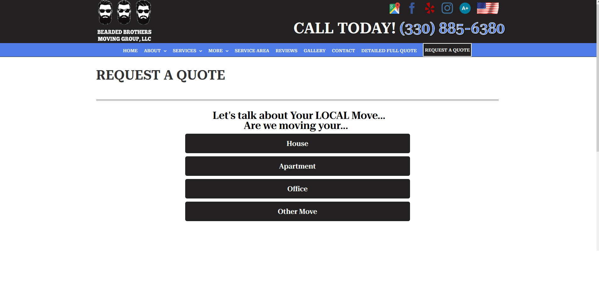
Everyone has seen a contact form. If your contact form is too short, the lead is less quality; if the form is too long, you’ll completely lose new business. No one should pack a sandwich, a water bottle, and let out an auditory *SIGH* as they fill it out. Interactive contact forms are the best (our forms out perform every form of every client we ever took on), or ones which soft-sell your value proposition without seeming desperate or a lead generation farm.
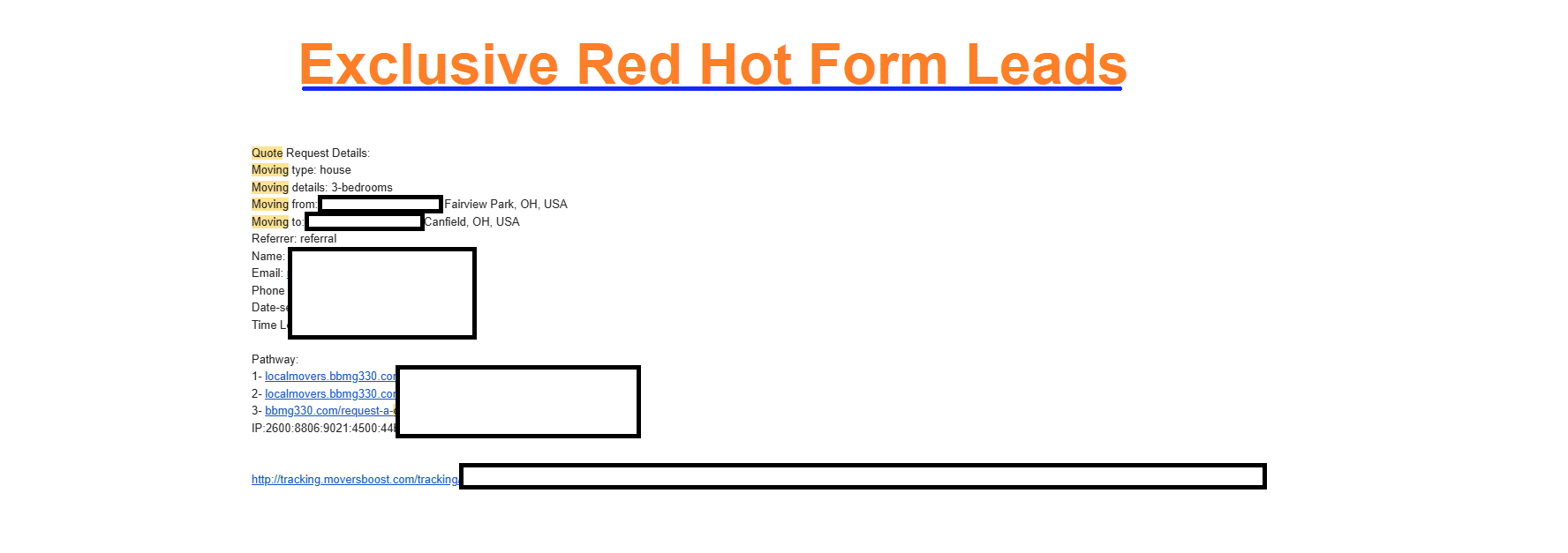
Using a CRM to manage your lead flows? Great. As we speak we send thousands of leads each month to our clients, using APIs to push data accurately and promptly.
3) Is this a Billboard? S Q U I R R E L !
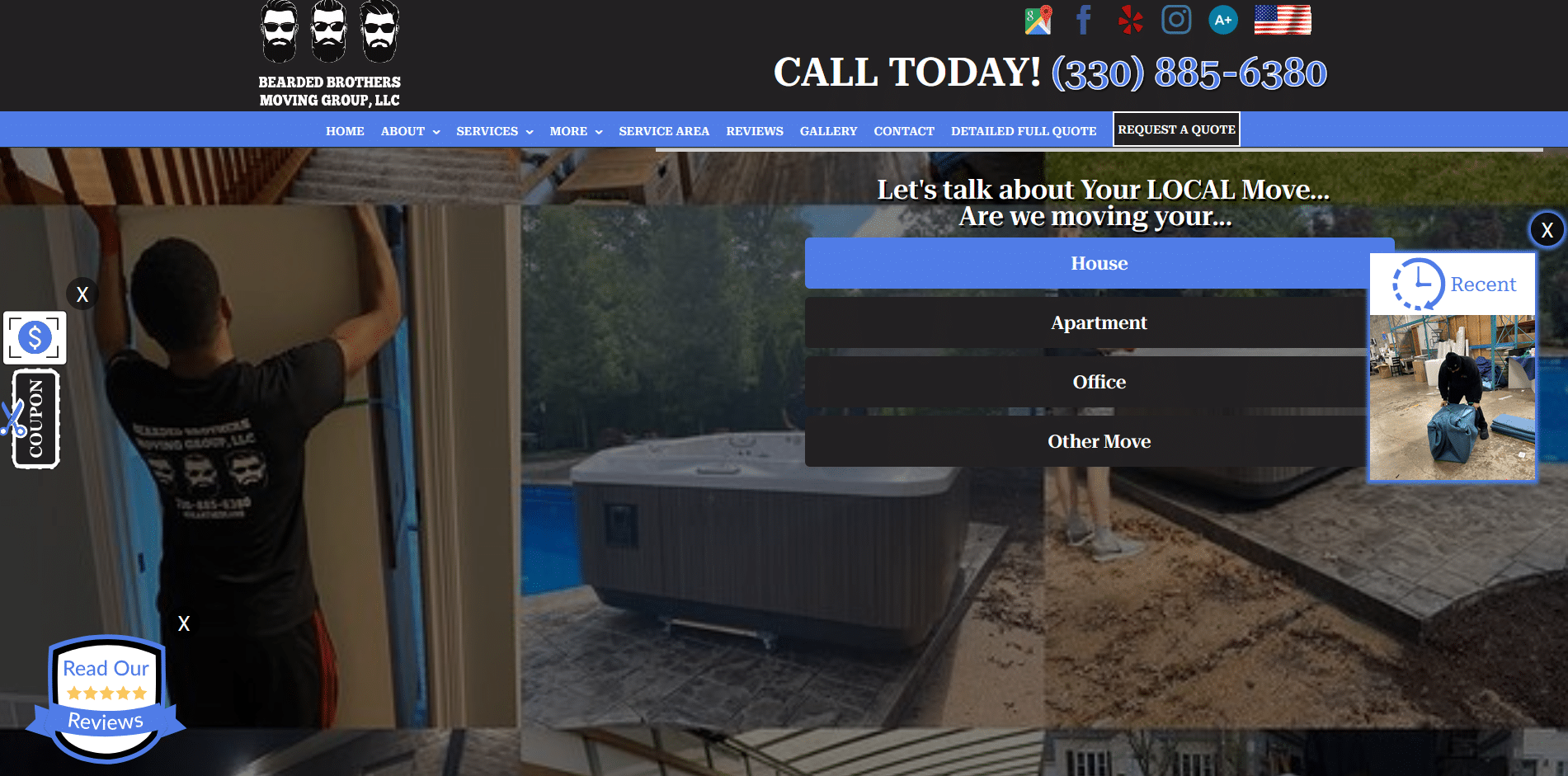
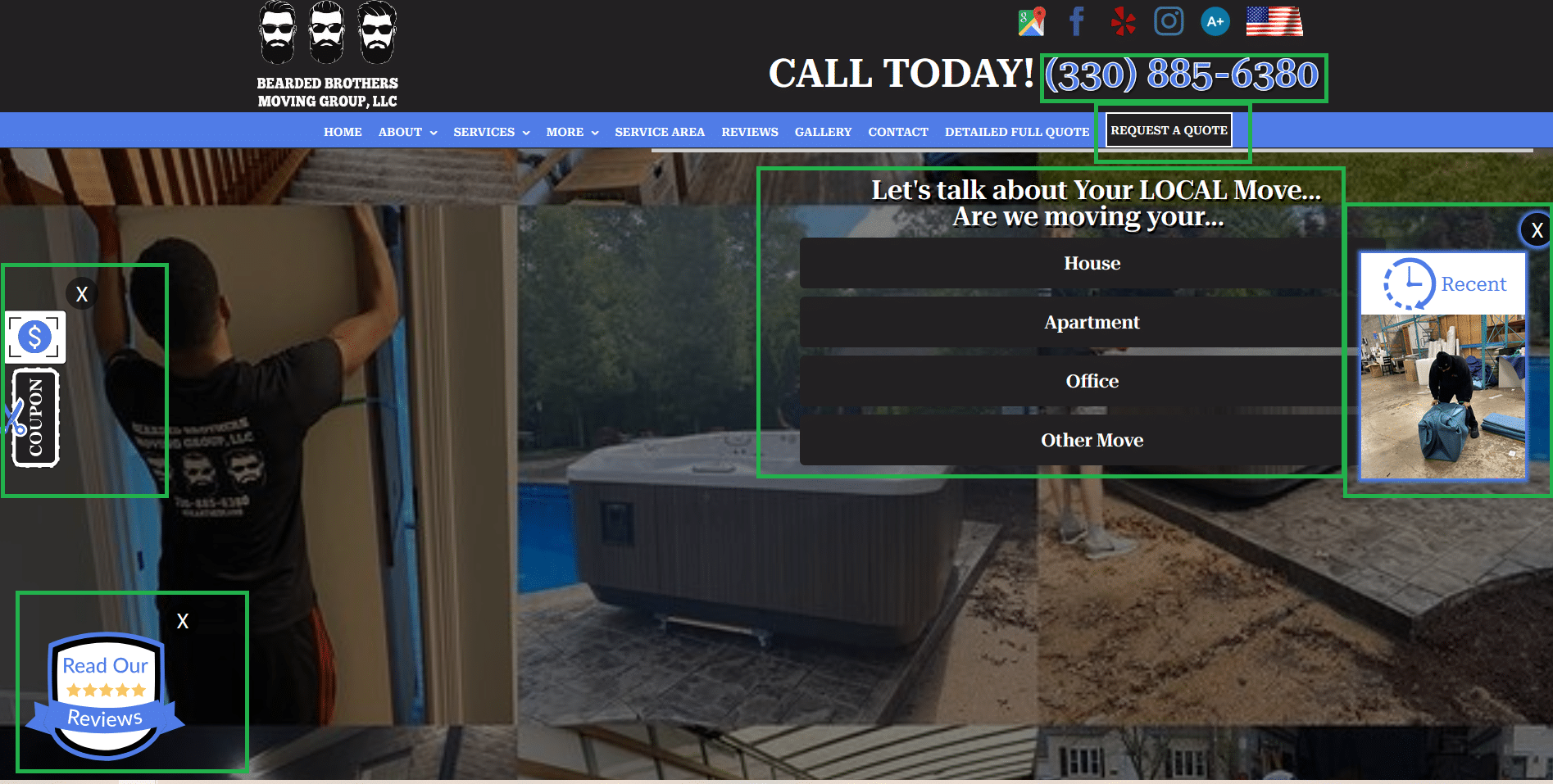
Your website better have something to do on it, or you lost! There are SIX separate Calls to Action on this one webpage. Your website should appeal to Grandma who just needs a Mover NOW, and has the phone in her hands.
4) Let Me Pull It Up on My Flip Phone
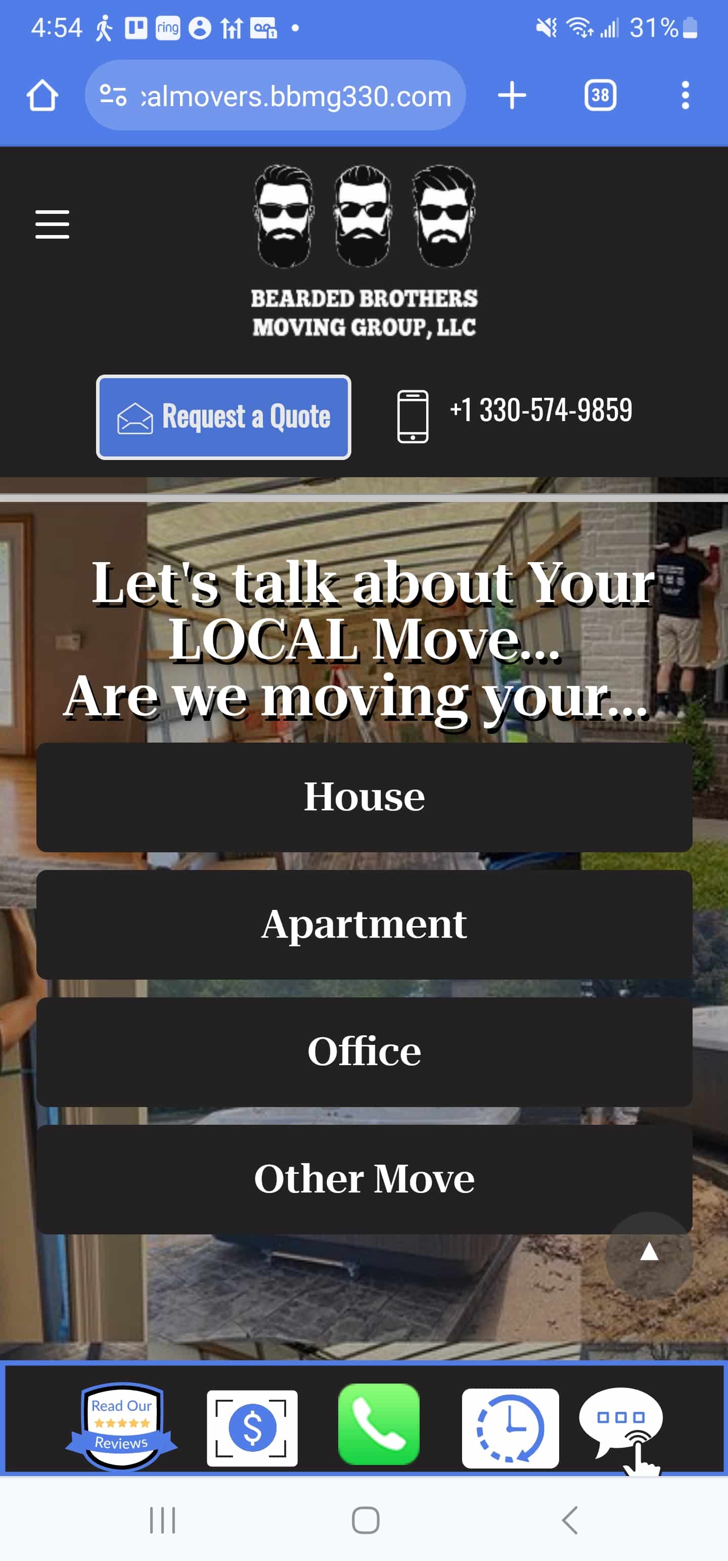
Over half your leads will come from people on the go – Mobile Devices. While I secretly love flip phones, todays customer demands professionalism and a mobile specific experience. The lazy web design of yester-year was “Responsive”. This is a nice way of saying, it is what it is – fit the screen no matter what the size.
We take this principle a step further. We create Mobile specific experiences, meaning this website version was designed only for mobile devices. Through the magic of the internet, web browsers can detect your device and connect to the mobile version or regular Desktop version. This leads to a high-quality user experience with your brand, and increases time on website, and calls to action, meaning more red hot, exclusive leads both from phone calls and form submissions.
5) More Exclusive Phone Calls and Lead Form Submissions
We have clients receiving hundreds of phone calls and lead form submissions each month. Best of all, they are 100% EXCLUSIVE. MoversBoost understands the role shotgun Free-For-All Lead providers offer, but the best thing is these leads are warmed up, red hot, and specifically contacting you for you – not just a quote. There is a huge difference between a high quality lead, and a tire-kicker. Just ask one of our clients.

